Visual Strategy & Layout Mapping
Planned a consistent layout formula for all thumbnails: Bold Title Block, Presenter image or subject icon, Branded color strip or element, and Consistent font and spacing
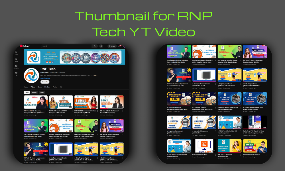
In the fast-moving world of YouTube, a well-designed thumbnail can make or break viewer engagement. For RNP Tech’s YouTube channel, I was brought in to design every single thumbnail, with one clear goal:
✅ Boost click-through rates
✅ Maintain a strong, consistent brand identity
From educational videos to product explainers, each thumbnail was built to stand out in search, speak visually to the topic, and represent RNP Tech’s evolving digital presence.
Before opening my design tool, I took time to understand:
Before diving into design, I analyzed who the content was for — SMEs, tech users, and workplace productivity teams. Understanding their mindset helped shape a relevant and engaging visual approach.
The main goal was to promote digital tools like E-WSHMS, E-DMS, and Toolbox Meetings. The design needed to support clear communication and improve viewer engagement.
I studied the brand’s desired feel — modern, professional, and approachable. This guided the tone of colors, typography, and layout decisions.
The client faced issues with inconsistent thumbnails, which led to weak branding and poor click-through rates. I addressed this by introducing a visual system to bring consistency.
Here’s how I handled the entire thumbnail project:
Planned a consistent layout formula for all thumbnails: Bold Title Block, Presenter image or subject icon, Branded color strip or element, and Consistent font and spacing
Focused on: Readability at small sizes, Bold contrast to stand out on YouTube feeds, and Relevant visuals to the subject matter. Designed 5+ Thumbnails for RNP Tech
Maintained color schemes tied to product categories. Aligned every thumbnail with the channel’s cover banner, logo, and brand voice. Ensured thumbnails worked on both desktop and mobile previews
Once approved by RNP Tech, I delivered the project with full clarity and support:
Delivered all thumbnails in 1280x720 px JPG format, matching YouTube's resolution standard. Each file was compressed for fast loading while keeping crisp visual quality.
Shared layered PSD templates so the RNP Tech team can easily tweak text, images, or layout. This gives full control for future thumbnail updates without starting from scratch.
Provided a reference document outlining font choices, spacing, and logo placement. This helps maintain visual consistency across future thumbnails, even with internal edits.
Each thumbnail went through a contrast and readability check to ensure text and visuals are legible on all devices - boosting click-through rates and viewer clarity.
Whether you’re a YouTuber, start-up, or growing company — your thumbnails are your billboards. I design scroll-stopping thumbnails that boost attention, establish brand trust, and invite clicks.