Concept Brainstorming
For each brand, I mapped a moodboard with fonts, icons, and color inspirations aligned to their business niche. Identified 2–3 possible design directions for each logo — minimal, bold, symbolic, etc.
A well-designed logo is more than just a visual—it’s the face of a brand. It sets the tone, builds trust, and often becomes the first impression a business makes.
In this project, I had the opportunity to design three distinctive logos for real clients, each operating in a different space:
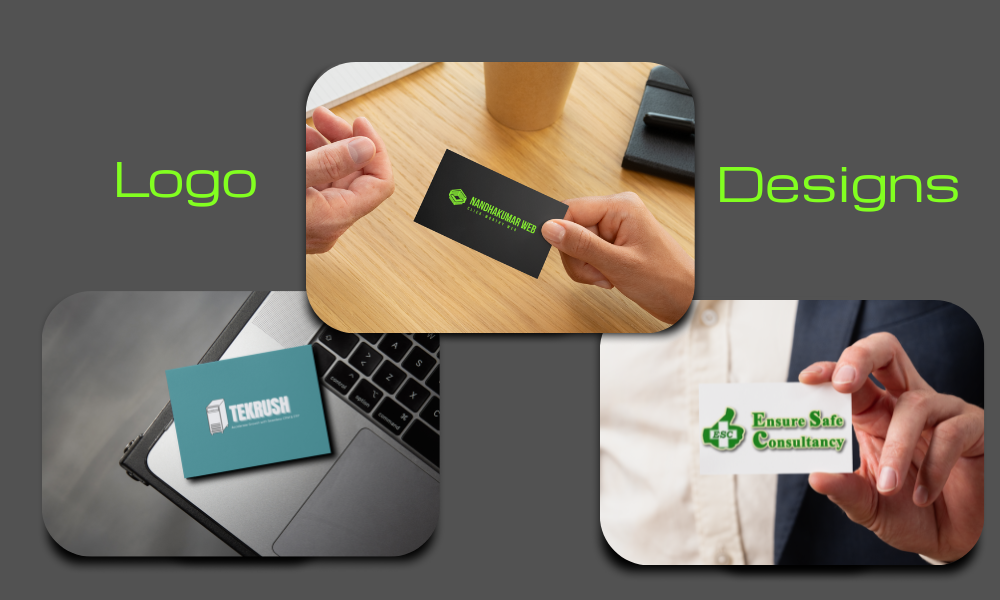
💼 TEKRUSH – A tech service company
🧑💻 Nandhakumar Web – A personal tech/portfolio brand
✅ Ensure Safe Consultancy (ESC) – A safety compliance and bizSafe service provider
These logos are now in use across each client’s digital platforms, business cards, and official brand touchpoints.
Before jumping into the design tools, I make sure I understand each brand’s personality, purpose, and audience. Here’s what I did for these three:
Prior to engaging in design execution, I conduct a thorough evaluation of the brand’s identity, positioning, and audience expectations. This ensures the creative output aligns with business objectives and long-term goals.
TEKRUSH: Required a forward-looking identity that represents technology-driven solutions and infrastructure reliability.
Nandhakumar Web: A personal branding initiative focused on conveying clarity, trust, and professionalism within the web development space.
ESC (Ensure Safe Consultancy): As a bizSAFE consultancy, the design direction emphasized compliance, assurance, and operational safety.
Every brand strategy was shaped by:
✍️ Communication style – formal, technical, or user-centric
🧠 Audience segmentation – enterprise clients vs individual service seekers
📦 Output versatility – from web presence to stationery and pitch decks
🎯 Market benchmarking – ensuring differentiation from industry competitors
The final assets were optimized for consistency across digital and offline touchpoints — including websites, social media, email communications, print materials, and stakeholder presentations.
This project required precision, brand alignment, and clarity. Here’s how I executed it:
For each brand, I mapped a moodboard with fonts, icons, and color inspirations aligned to their business niche. Identified 2–3 possible design directions for each logo — minimal, bold, symbolic, etc.
TEKRUSH: Chose a block-style font to express tech stability and Blue and grey for trust and tech feel. Nandhakumar Web: Went with a monogram+name style logo and Used a hexagonal symbol resembling both tech and simplicity. ESC: Incorporated a thumbs-up icon within the initials “ESC” and Green to symbolize safety, growth, and approval.
All three logos underwent 1–2 minor iterations. Ensured compatibility across various sizes and formats (print/digital). Delivered mockups on business cards, laptop stickers, and in-use previews to help them visualize branding in action.
Created a brand sheet outlining logo usage rules, color specifications, and typography choices. This helped the client maintain a cohesive brand presence across channels. Included dos and don’ts for logo placement to avoid misuse and ensure visual integrity.
Once the design and testing were complete, I delivered the project with full clarity and support:
Delivered a professional CMYK PDF file, set up with proper bleed and trim marks for seamless printing. It’s ready for high-quality output at any commercial press.
Delivered transparent PNGs, SVGs, and vector logo files to ensure flexibility across print, web, and screen usage. These formats have quality in all mediums.
Supplied logos and icons in small sizes suitable for social media profiles, favicons, and app icons—ensuring consistent branding across platforms and devices.
Shared a simple color palette and typography guide for future use. Helps maintain design consistency—optional but included if the client preferred ongoing branding clarity.
Your logo is more than a mark. It’s a message. I design strategic brand identities that connect with your audience and elevate your presence - whether you’re a startup, personal brand, or growing enterprise.